NEW YORK: This week Google announced the launch of Android 5.0 Lollipop, the most radical design overhaul of Android since it launched in late 2008. Six weeks ago Apple announced iOS 8, one of the most exciting and expansive releases of iOS since it debuted in 2007 (under the name ‘Mobile OS X’). It is now time to put them head-to-head.
For Apple the hard work was done last year with iOS 7. Out went Steve Jobs’ beloved skeuomorphism and in came minimalist flat design. It wasn’t met with universal praise and it certainly became more cartoonish, but iOS 7 was clean, modern and established Apple’s new design language.

iOS 8 builds on this good work adding more consistency and refining iconography, but it also has some smart design tweaks with regards to notifications, widgets, multi-tasking and keyboard interaction which I’ll go into in more detail in the Features section on the next page.
In addition to this iOS 8 makes better use of gestures for navigation: most notably a swipe from the left edge to go back and a double tap of the home button for ‘Reachability’ which slides the whole screen down. These are smart moves given the jump in screen size with both the iPhone 6 and, in particular, the iPhone 6 Plus.
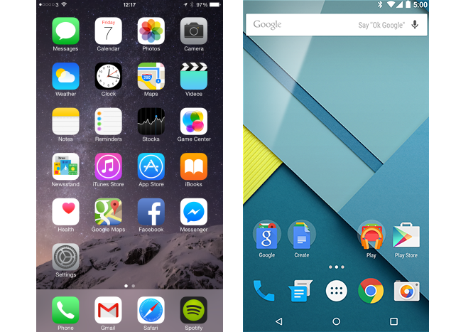
By contrast Android 5.0 Lollipop represents the biggest redesign in Android history. Like iOS 7, it sees Google ditch almost all vestiges of skeuomorphism in favour of a flatter, more minimalist design. But unlike iOS, Material Design is more than respray. It is an ideology.
As the name suggests, Material Design is more about physicality than superficiality. It has specific physical rules about how buttons should react when touched, how different UI layers should interact and how animations are both trigger and unfold and this is being pushed on third party app developers as well.
The aim of all this is to not only introduce a highly consistent experience for the user, but to enhance their understanding of what is happening. For example, animations originate from the point of contact, key action buttons are highlighted in a standout colour and layouts are consistent from app to app.
Comparing the iOS 8 and Android 5.0 Lollipop is a shock, because for the first time in Android history it has become more design focused than iOS. The ugly duckling is finally a swan. Its design is both visual, instructional and altogether more ambitious.
Not everything is right out of the gate. If anything Material Design is overly white and spread out (you can see less information in most apps – eg fewer emails, lines of text, etc) whereas its predecessor Android 4.4 KitKat was too dark and dense.